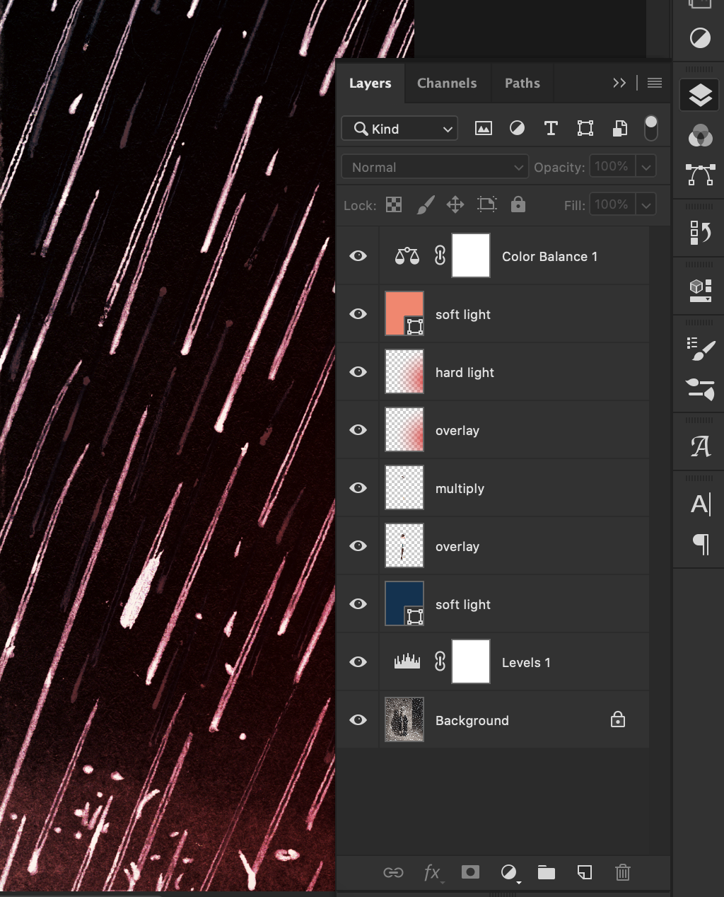
I made a short video showing a method I use to color an ink drawing digitally (specifically in Photoshop).
35mm photos from October 2020
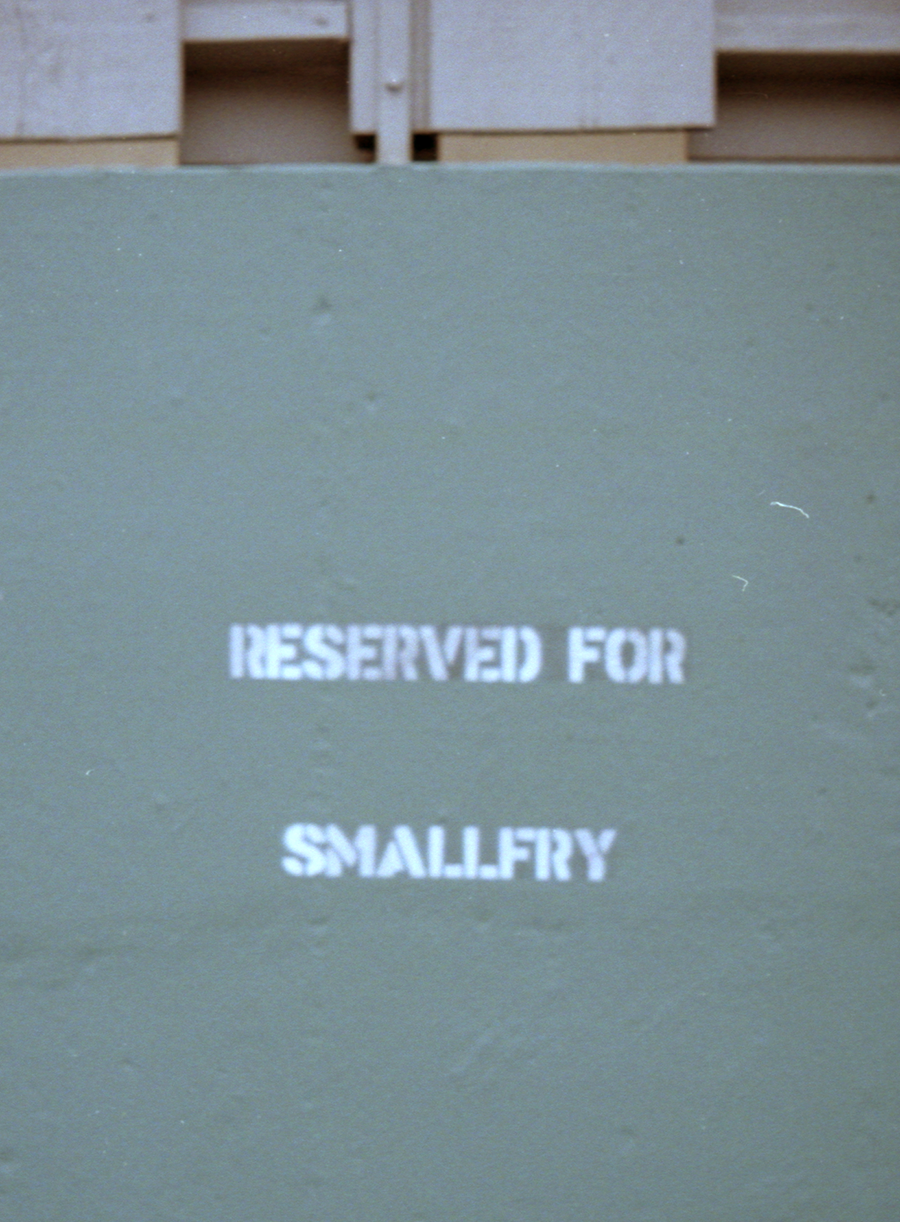
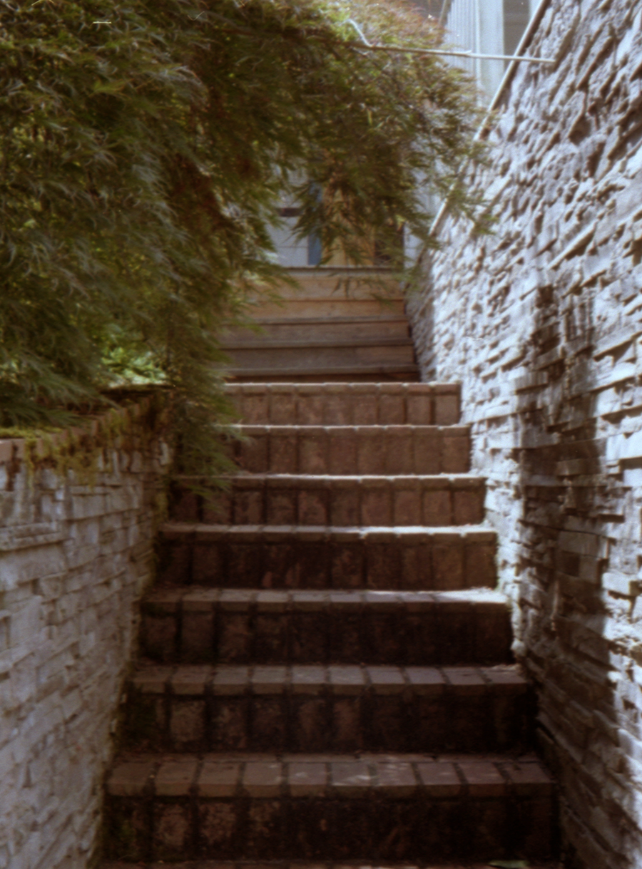
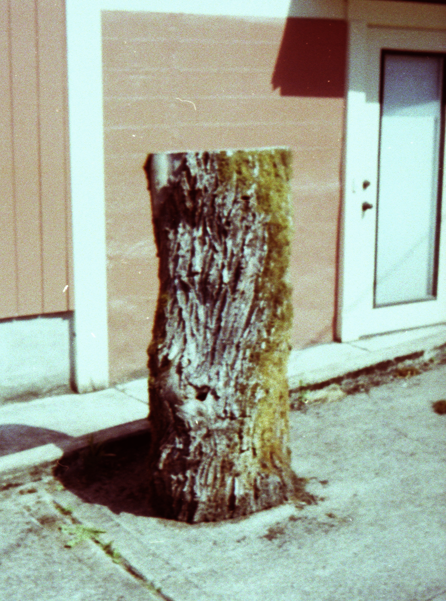
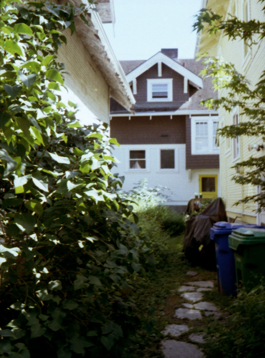
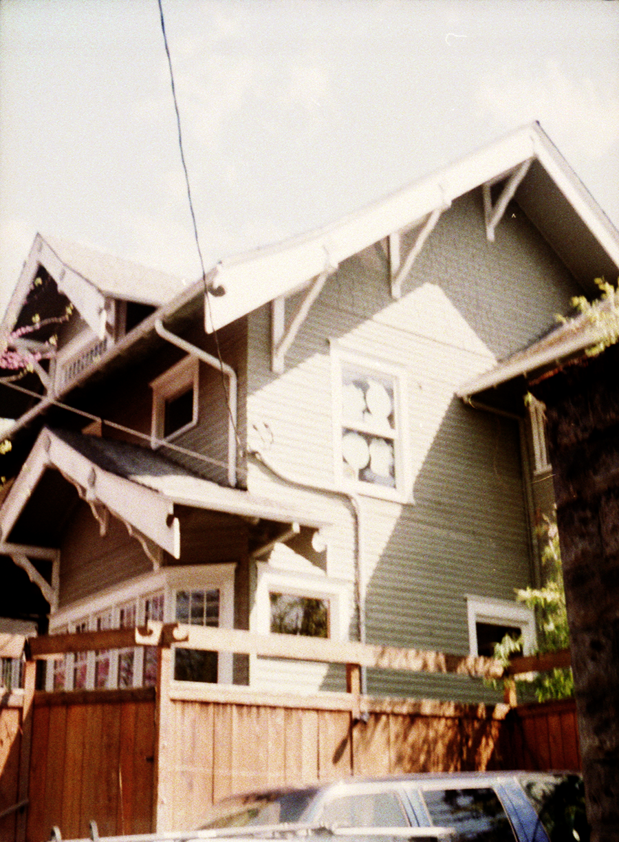
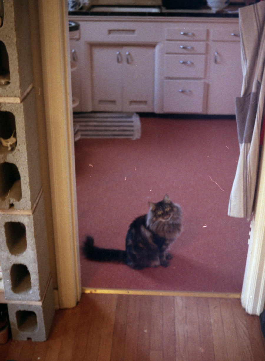
Still taking lots of photos, still developing b&w film myself. Here are some more of them, in no particular order. 35mm on various cameras.
Digital Photos, Fall 2020
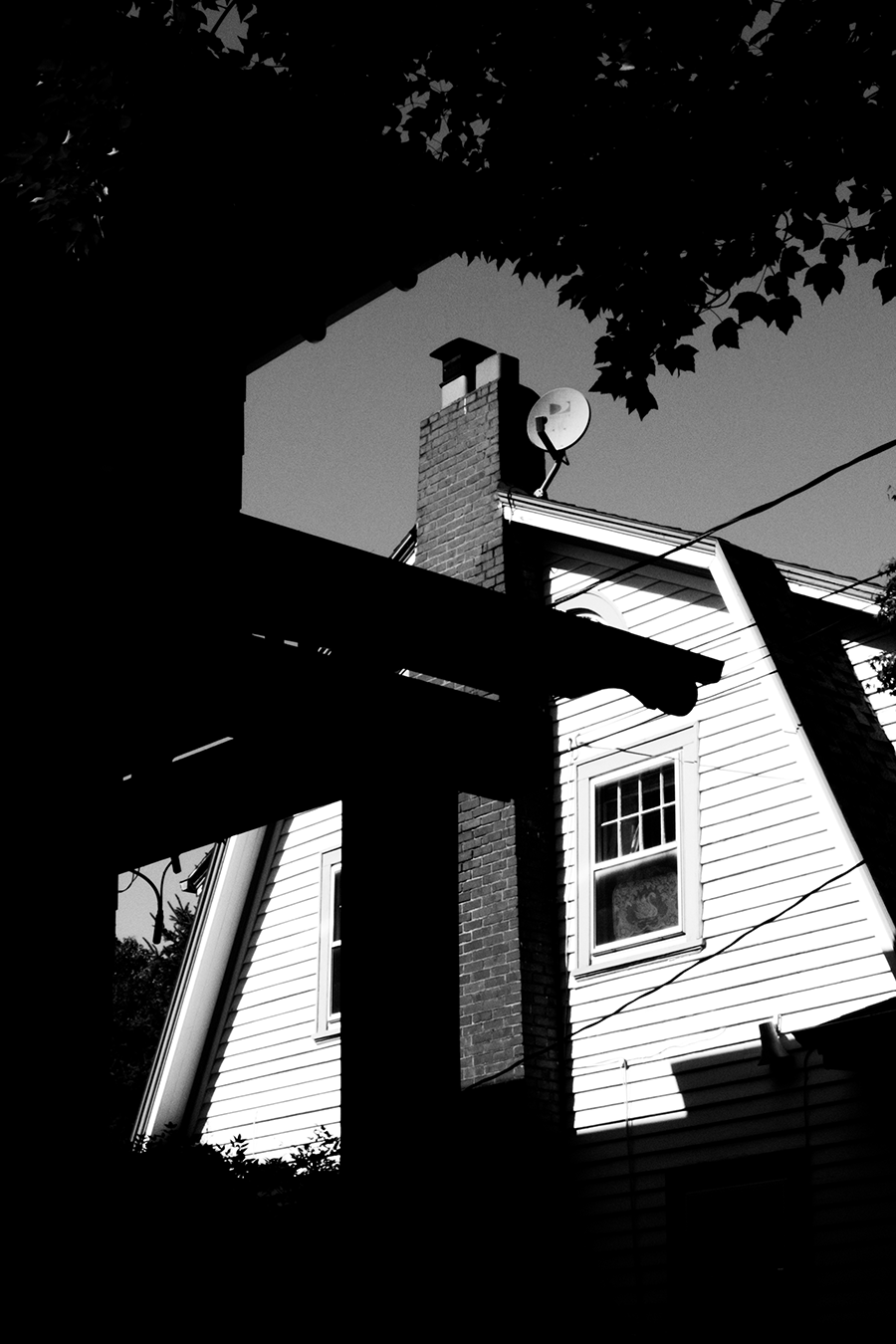
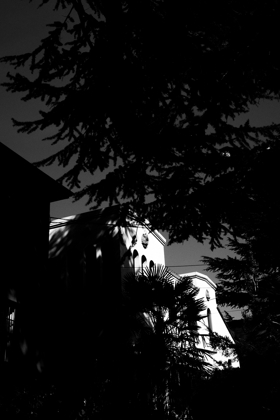
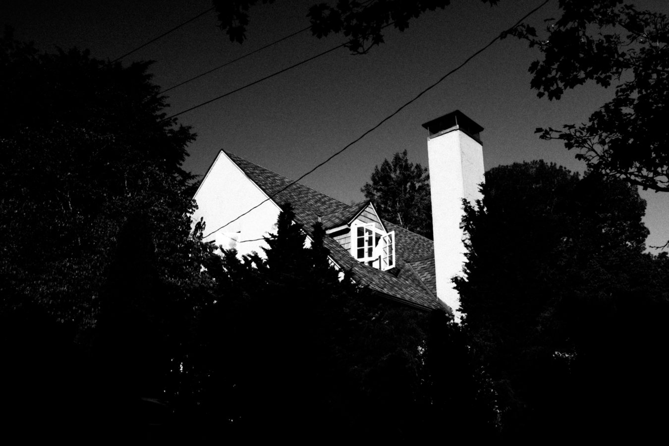
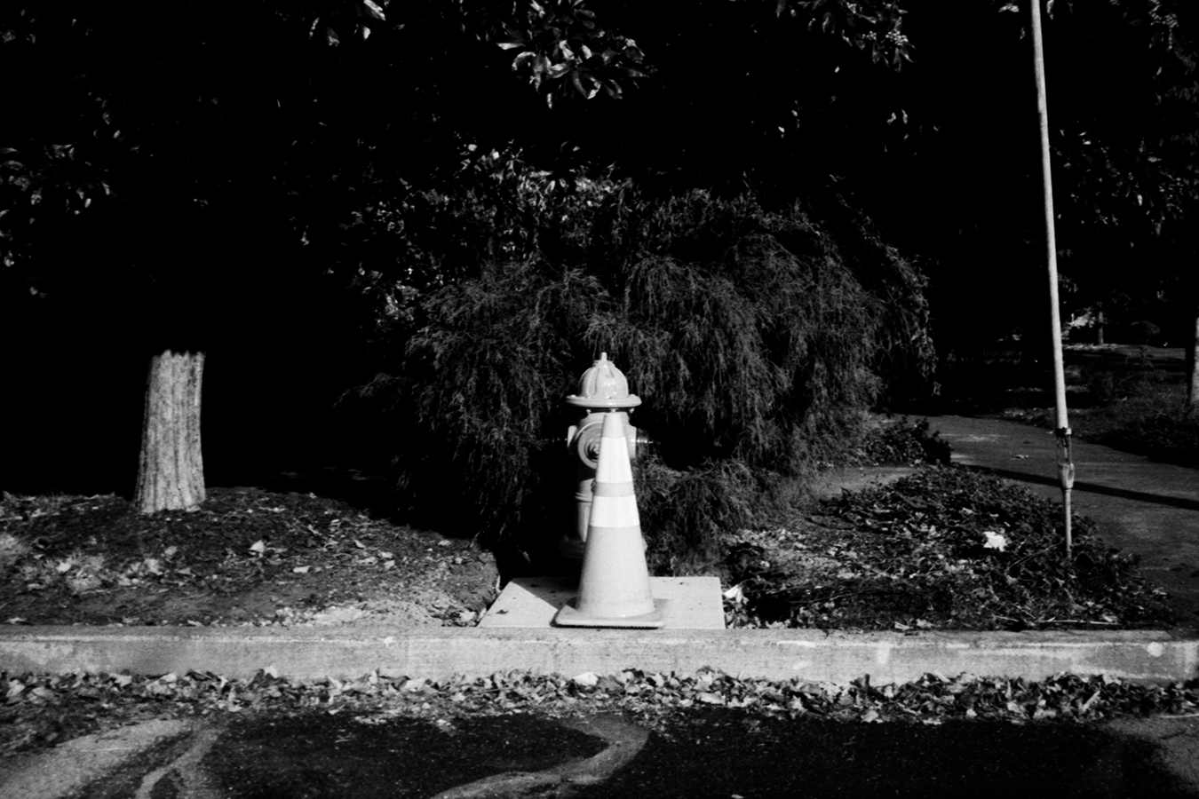
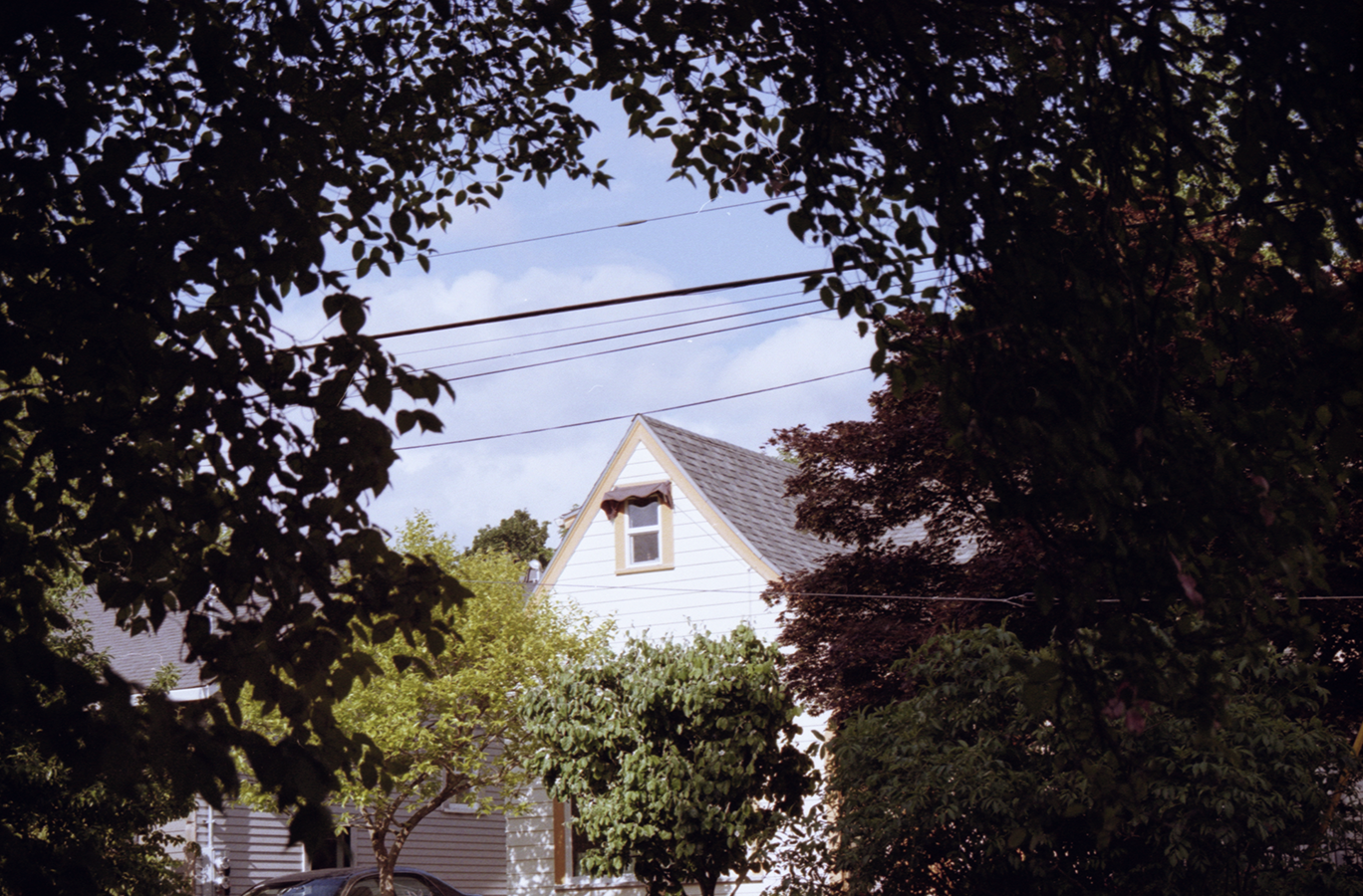
Some recent digital photos, taken in Portland.
Photos, 35mm, Fall 2020
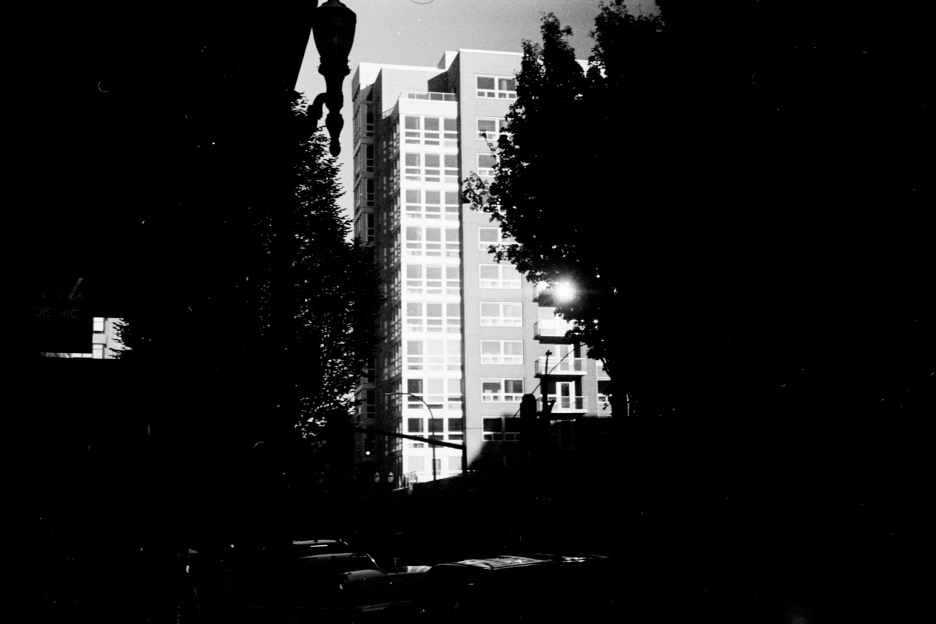
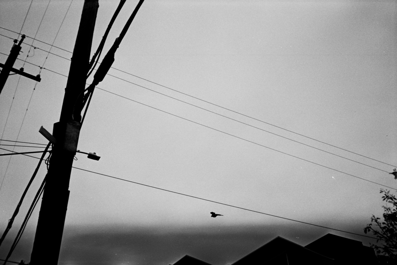
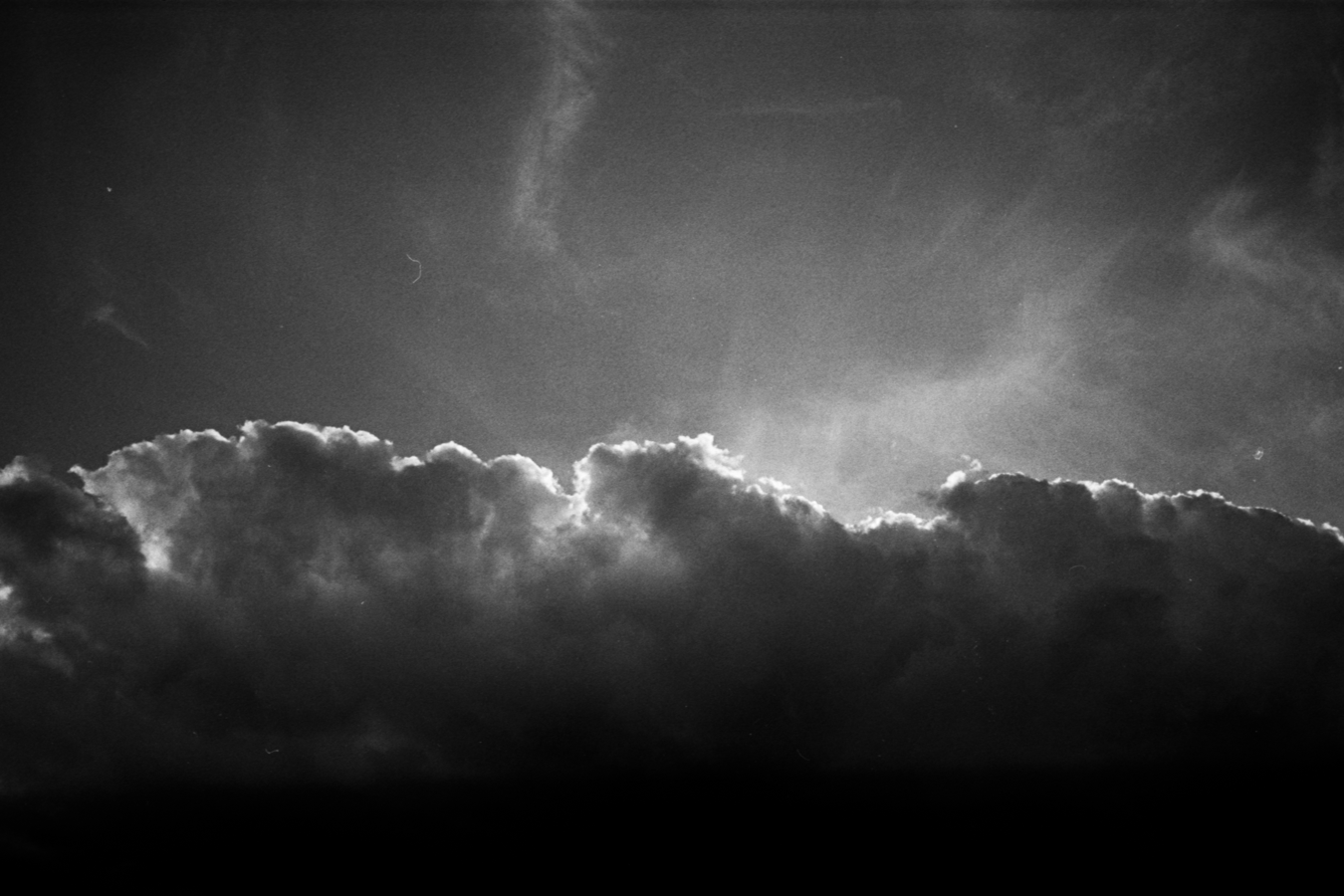
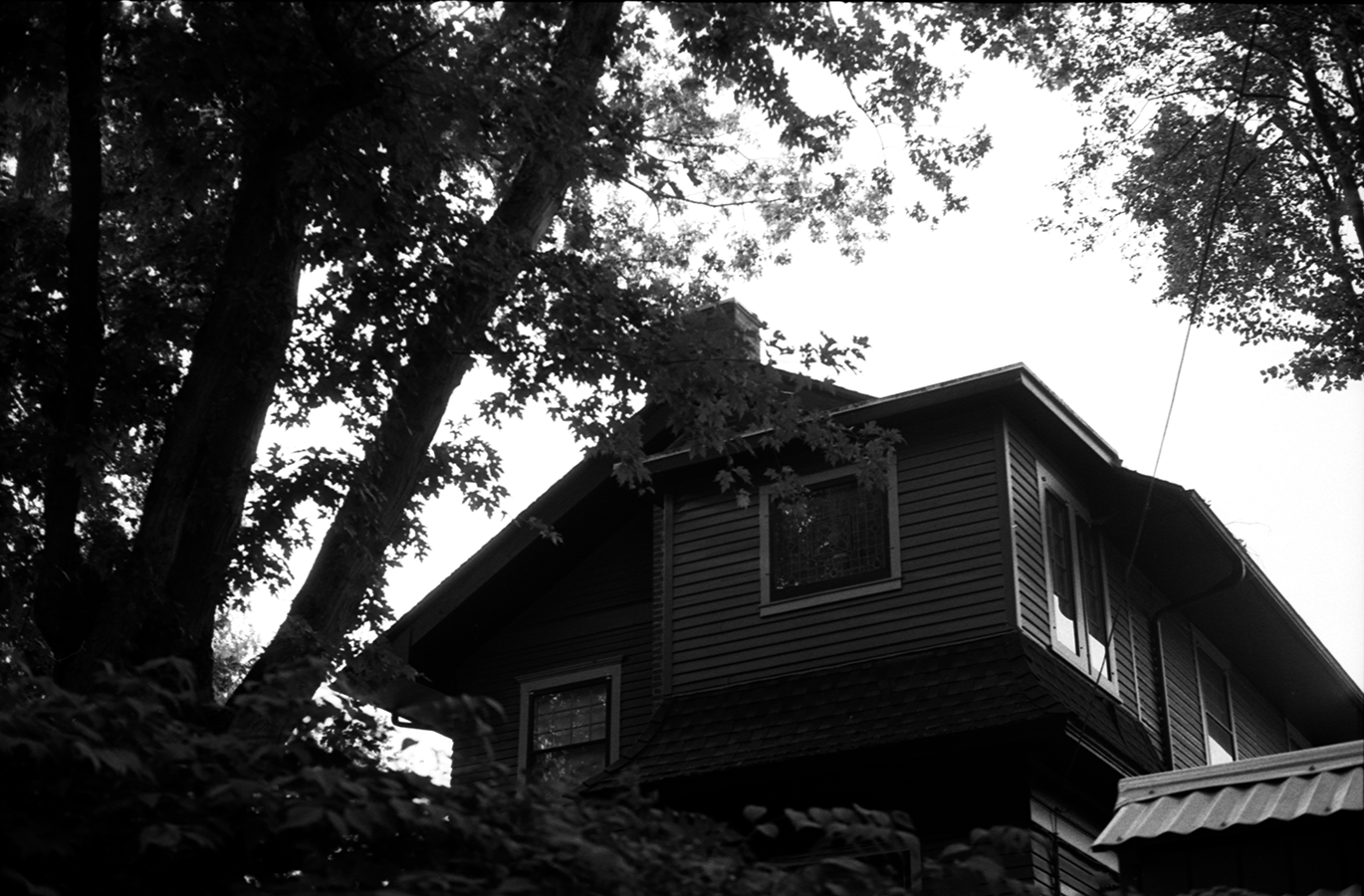
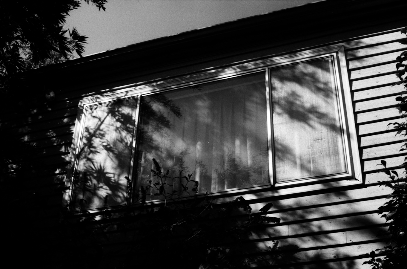
I’ve recently learned to develop black and white film, so I’ve been shooting a lot of 35mm photos and developing/scanning/processing the rolls myself in my studio. I’ve also been practicing pushing the film to higher ISOs to make the images really grainy and contrasty and I’ve been happy with the results. Here are a few recent shots. These were shot on a Ricoh AF-40 and a Canon P with a 50mm lens, using various B&W films.
Portland Collective, group show at Nucleus Portland (Sept. 2020)
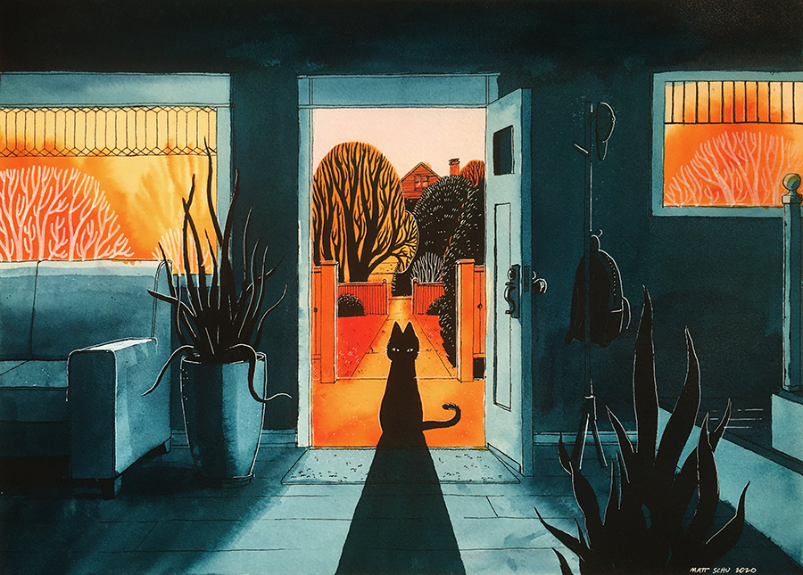
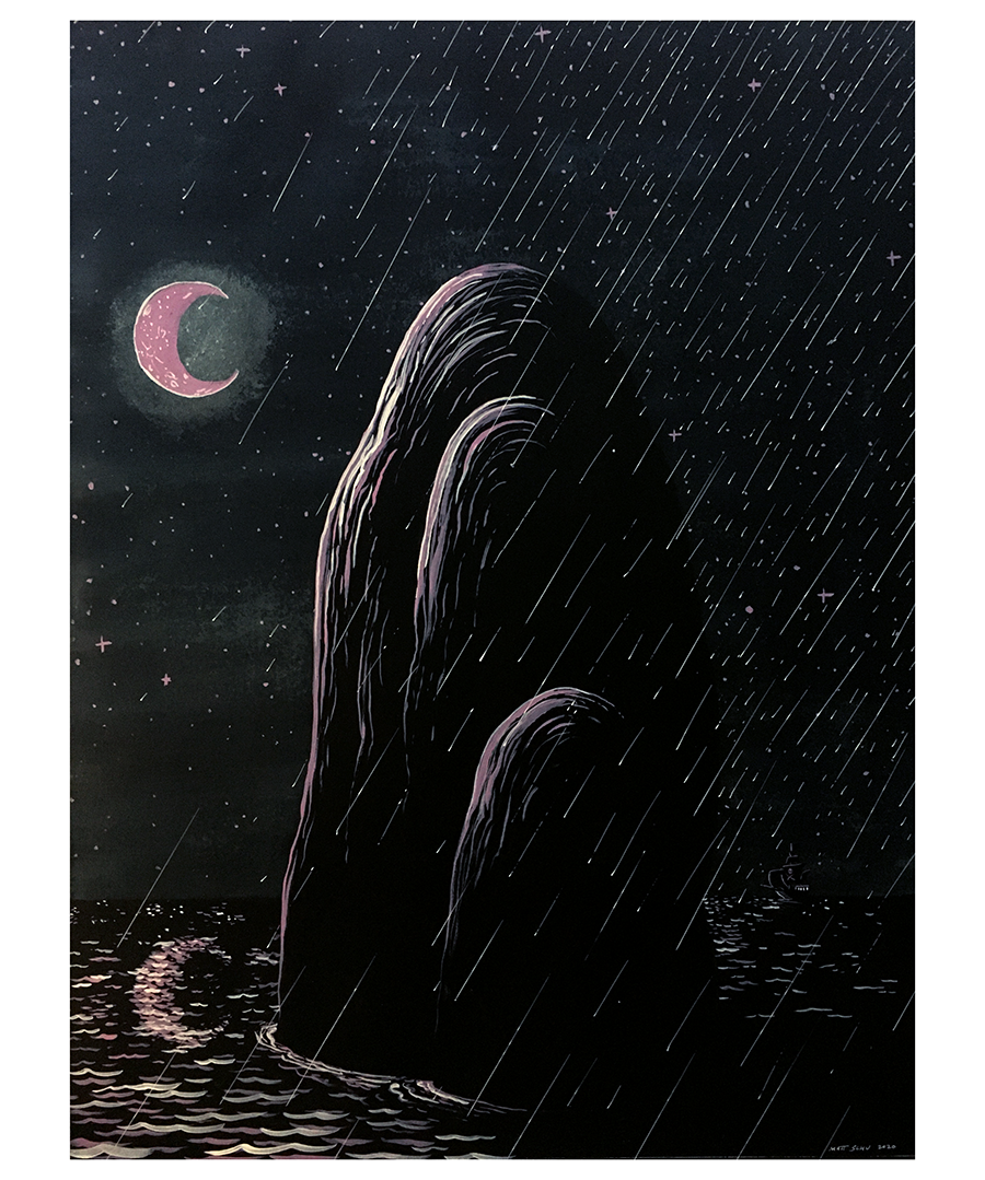
I had the privilege of being included in a group show at Nucleus Portland, which included 4 of my drawings (pictured). The show has now ended, but you can check out the work in the show online: Portland Collective.


Photos, May 2020
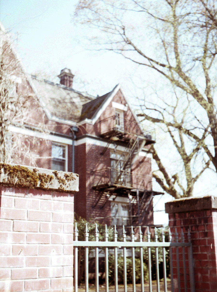
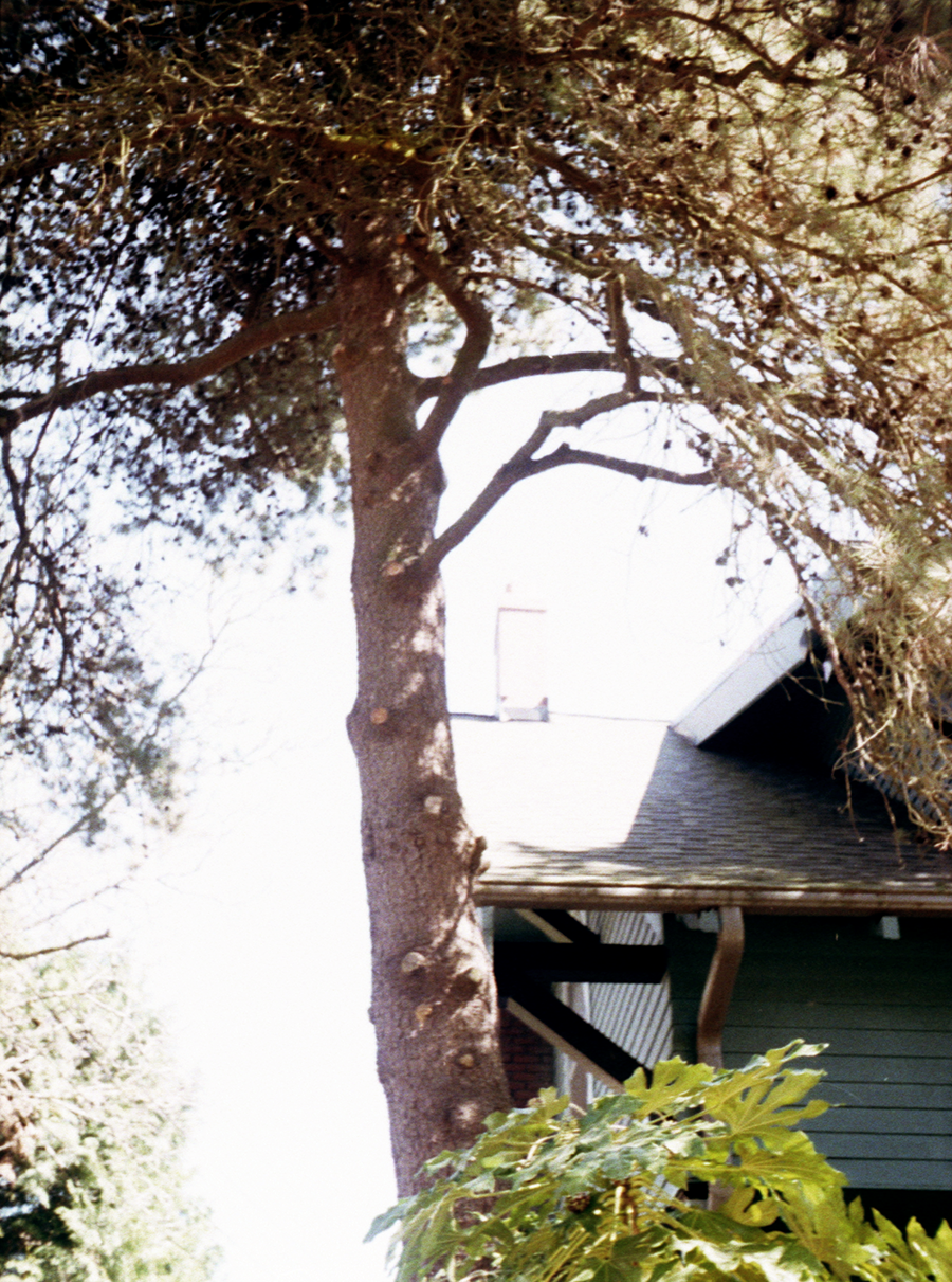
35mm photos shot with Kodak Colorplus 200 film on an Olympus OM-2S camera. May 2020 in Portland.
Half-frame Photos, July 2020
Some half-frame photos from a roll I shot in Portland in early July 2020.
Process Post - "Salut! V" coasters
I contributed 6 drawings on coasters to Nucleus Portland gallery’s “Salut! 5” group show which opened on June 12th. I took a few photos while I was making them so I’ve put together a short post to explain the process.
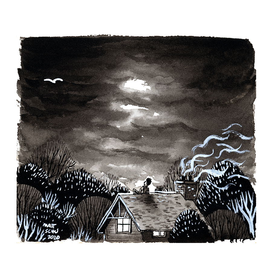
Before starting on the coasters I made a small ink/gouache drawing of a person sitting on a roof looking up at the sky (fig. 1). I wasn’t planning on using that as the basis for all my coaster drawings, but after I made it I thought it would be fun to make variations of it with different things in the sky, and decided that would translate well to the coasters.
Since it was important to make the parts that were the same across all the coasters be as identical as possible, I did a graphite transfer to make the pencil lines on each blank coaster. To make the transfer I traced the preliminary drawing onto a piece of printer paper and then covered the back of the paper with graphite. Then I put the tracing on top of the blank coaster, graphite-side down, and traced the drawing (pushing down fairly hard). The result is that the lines get transferred in graphite onto the coaster, like a carbon-copy. (fig. 2)
After that was done I traced the pencil lines in waterproof black ink (fig. 3), which I did with a nib and brush. It was important for the ink to be waterproof because otherwise adding color on top would make the lines run.
At this point I began adding color to all of them at once, and they were all finished at more or less the same time. I used colored ink, water, and white acrylic gouache which I mix with the ink. After I finished them all, I sprayed them with a matte varnish to even out the sheen and hopefully give them some protection. (Even though these are coasters, I think it’s safe to assume these are not at all waterproof.)
Well, that’s the whole process. You can see the finished product here (fig. 4). Also check out the other coasters from the show online at Nucleus Portland’s website. As usual there is a lot of excellent work in the show.


Photos, April-May 2020
More photos shot on my half-frame film camera, from late April and early May 2020.
The control over the focus and aperture is pretty limited with this camera, so I still don’t fully know what to expect when I shoot with it. Lots of pics were too out-of-focus or over-exposed, but I like how many of them turned out. The out-of-focus and blown-out quality of the pics from this camera is really interesting. I love how this quality makes the pictures look like they’re from another time, or a dream. It calls to mind a different world when I look at them, and I like taking pics of stuff just to see how it’ll look filtered through this camera. It’s making me notice things I hadn’t before, even when I’m not taking any pictures.
Process Post - Posted Keep Out
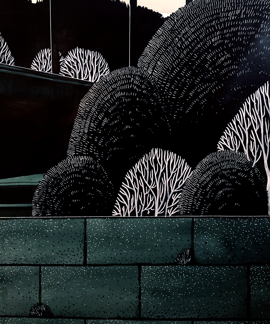
Based on a spot I saw in NE Portland, this drawing is 32x41.5”, ink on paper.
Here it is with some close up/context shots:
“Posted Keep Out”, Matt Schu, 2020, ink on paper, 32x41.5”
And here are a few pics of it in-progress:


Inspiration: Ed Ruscha
From Wikipedia:
Edward Joseph Ruscha IV (roo-SHAY; born December 16, 1937) is an American artist associated with the pop art movement. He has worked in the media of painting, printmaking, drawing, photography, and film. Ruscha lives and works in Culver City, California.
I’ve been really into Ed Ruscha recently, so I thought I’d repost some of his works that I found on his website. Hopefully you can take inspiration from this stuff as I have.
I love seeing Ruscha’s process stuff, his preliminary sketches for larger/more elaborate works, so that’s most of what’s represented here. In fact, I like to see that for any artist. It’s so intriguing how much of this stuff is on random scraps of paper, and has gotten me thinking about my own process and perhaps making the surface a work lives on more part of my work as a whole, or at least giving it more consideration.
I also love Ruscha’s use of text, and how when context is removed from a word or phrase a huge amount of context is left to be assumed by the viewer, giving the words such a mysterious and weighty presence. In most of our experience seeing written words, the letterforms are these hyper-precise, usually computer generated glyphs. By contrast, the words he’s drawn are not perfect, and it makes them feel more alive somehow. And when I look at them I can’t help but imagine him drawing them, and me drawing them. I love when a work of art shows the artist’s hand.

![ROSSETTI [#3] 1963 Ink on paper 14 x 8 1/2 inches](https://images.squarespace-cdn.com/content/v1/55052e78e4b04d51bd4911b0/1587796529987-UKY774A5D9KOPQ8NJH2C/ROSSETTI+%5B%233%5D+1963+Ink+on+paper+14+x+8+1%3A2+inches.jpg)


![RADIO [#1] 1963 Oil and ink on paper 14 5/8 x 12 3/4 inches](https://images.squarespace-cdn.com/content/v1/55052e78e4b04d51bd4911b0/1587796527368-08NQNY8W4EH8EW8DP5NS/RADIO+%5B%231%5D+1963+Oil+and+ink+on+paper+14+5%3A8+x+12+3%3A4+inches.jpg)


![HONK [#2] 1964 Graphite on paper 13 1/4 x 21 1/2 inches](https://images.squarespace-cdn.com/content/v1/55052e78e4b04d51bd4911b0/1587796526496-QJEJA589BPGB9UOP0U0H/HONK+%5B%232%5D+1964+Graphite+on+paper+13+1%3A4+x+21+1%3A2+inches.jpg)

![MERCY [#2] 1973 Blood on paper 23 x 29 inches](https://images.squarespace-cdn.com/content/v1/55052e78e4b04d51bd4911b0/1587796542212-FRDW5WIVILWK2PUF1LGH/MERCY+%5B%232%5D+1973+Blood+on+paper+23+x+29+inches.jpg)


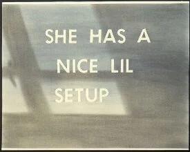


![HOLLYWOOD STUDY [#1] 1968 Pastel and pencil on paper mounted on paper 17 1/2 x 44 1/2 inches](https://images.squarespace-cdn.com/content/v1/55052e78e4b04d51bd4911b0/1587796524649-IV0ADG3Q28JOMY3B9ZKR/HOLLYWOOD+STUDY+%5B%231%5D+1968+Pastel+and+pencil+on+paper+mounted+on+paper+17+1%3A2+x+44+1%3A2+inches.jpg)

![HOLLYWOOD STUDY [#6] 1968 Gouache on silkscreen on paper 17 9/16 x 44 9/16 inches](https://images.squarespace-cdn.com/content/v1/55052e78e4b04d51bd4911b0/1587796541105-JRUQN1D4GPK95RL3V6P8/HOLLYWOOD+STUDY+%5B%236%5D+1968+Gouache+on+silkscreen+on+paper+17+9%3A16+x+44+9%3A16+inches.jpg)


Half-frame Photos - Early April 2020
I recently got a half-frame 35mm camera, an Olympus Pen EE-S. It only exposes half of the normal 35mm frame at a time, so I can get twice the photos out of a roll of film than I can with a normal camera (and each image is half normal size). These are photos from the first roll I shot to test it out, with Fuji Xtra 200 film. Most of them turned out way over-exposed, but I like a bunch of them. Looking forward to figuring this camera out more.
Photos, late March 2020 pt. 2
Some 35mm photos from a walk I took in late March, about a week into “social isolation”. Shot on Fuji Xtra 200 film with Fujica Auto-M camera.
Photos, 5 April 2020
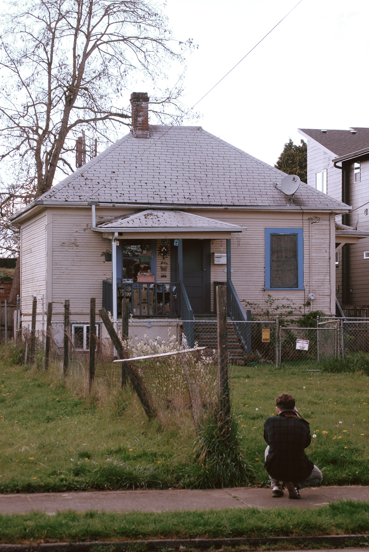
Some more digital photos, from April 5th. I took a very long walk that day around NE Portland.
Photos, late March 2020
I recently got a Nikon DSLR so I’ve been taking some non-film photos. Here are a few from the last few days of March. The weather has been nice during social isolation so I’ve been able to take some good walks. And I have a lot more free time now that I’ve lost my day job…
Photos, March 2020 pt. 2
These photos are from a roll of Kodak Gold 200 I shot on an Olympus OM-2S throughout March. NE and N Williams neighborhoods in Portland.
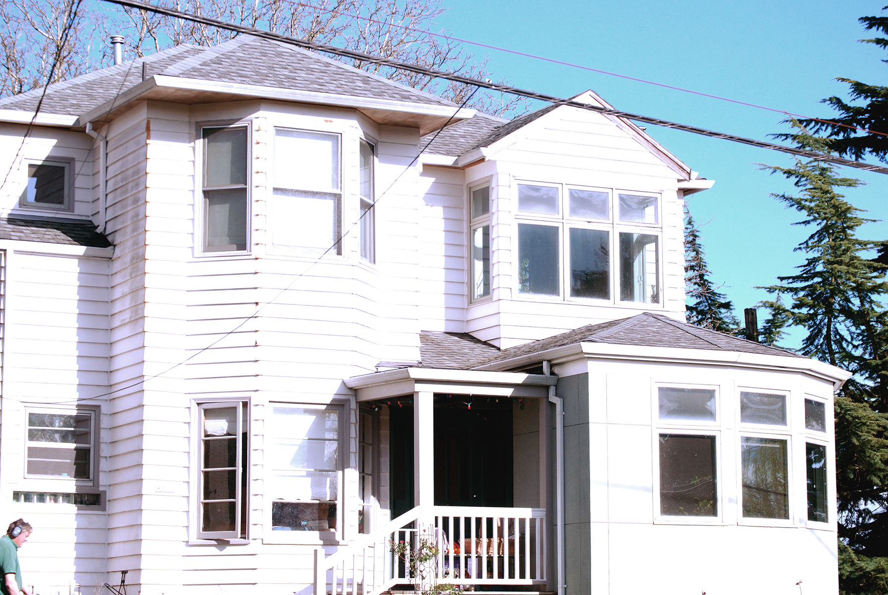
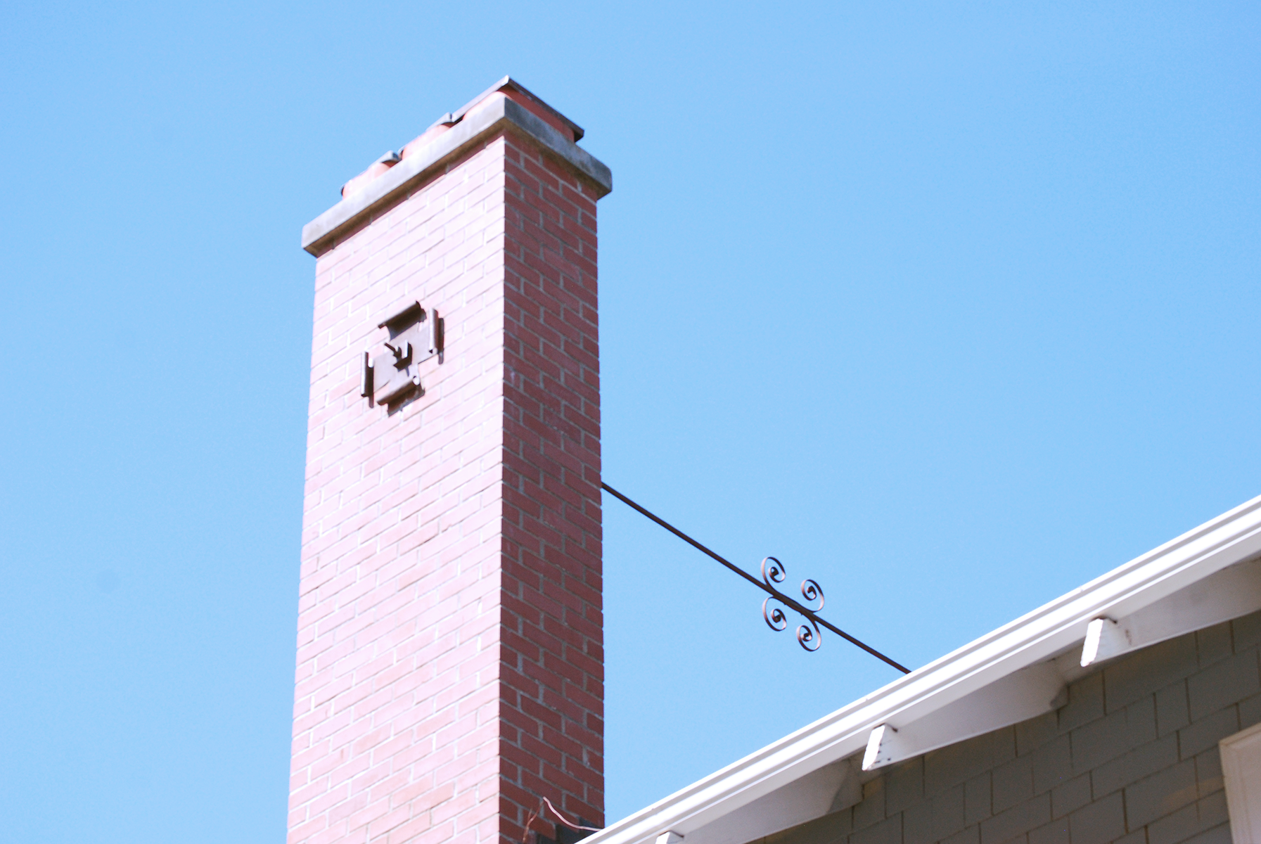
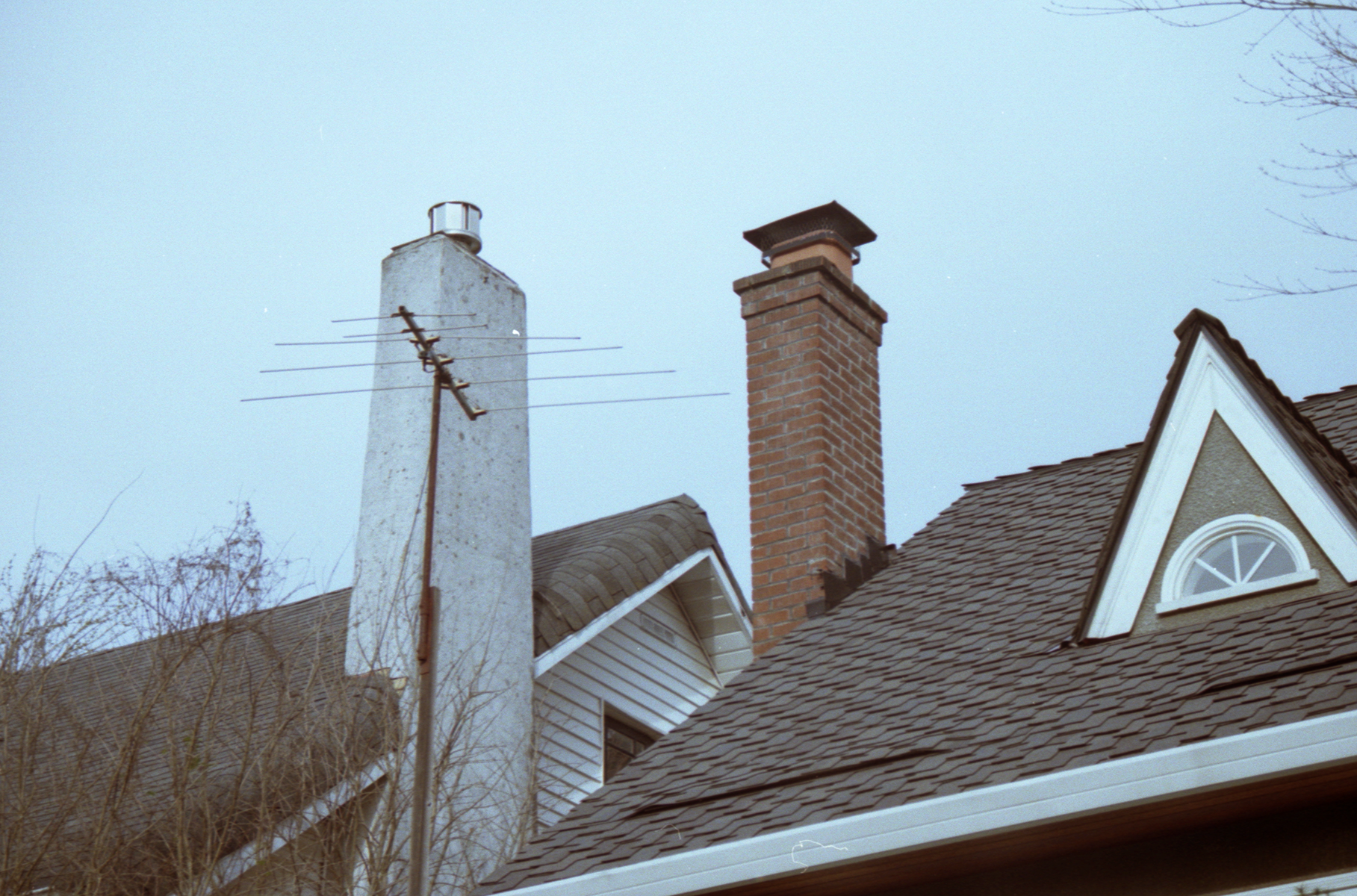
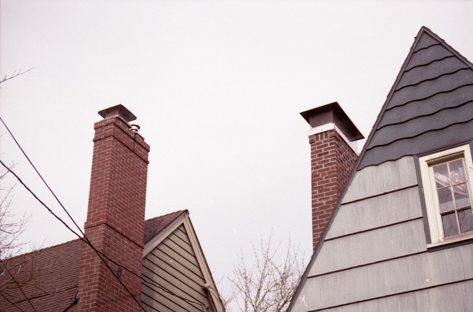
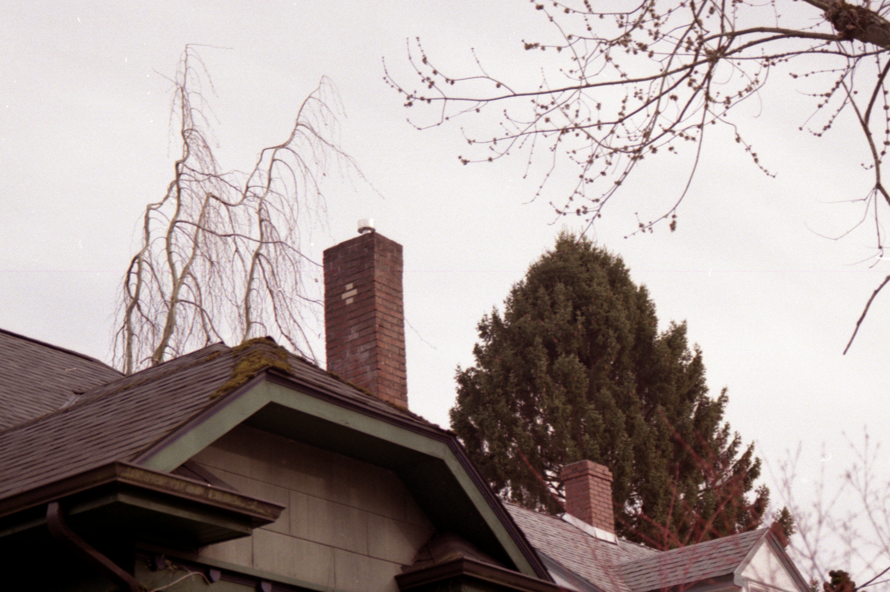
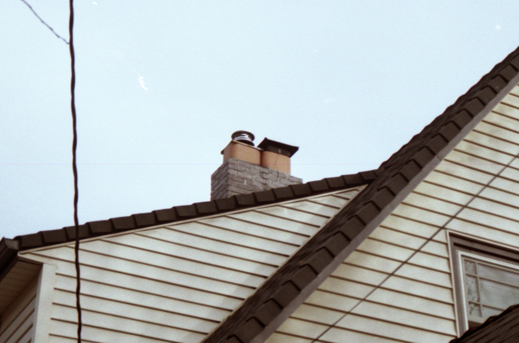
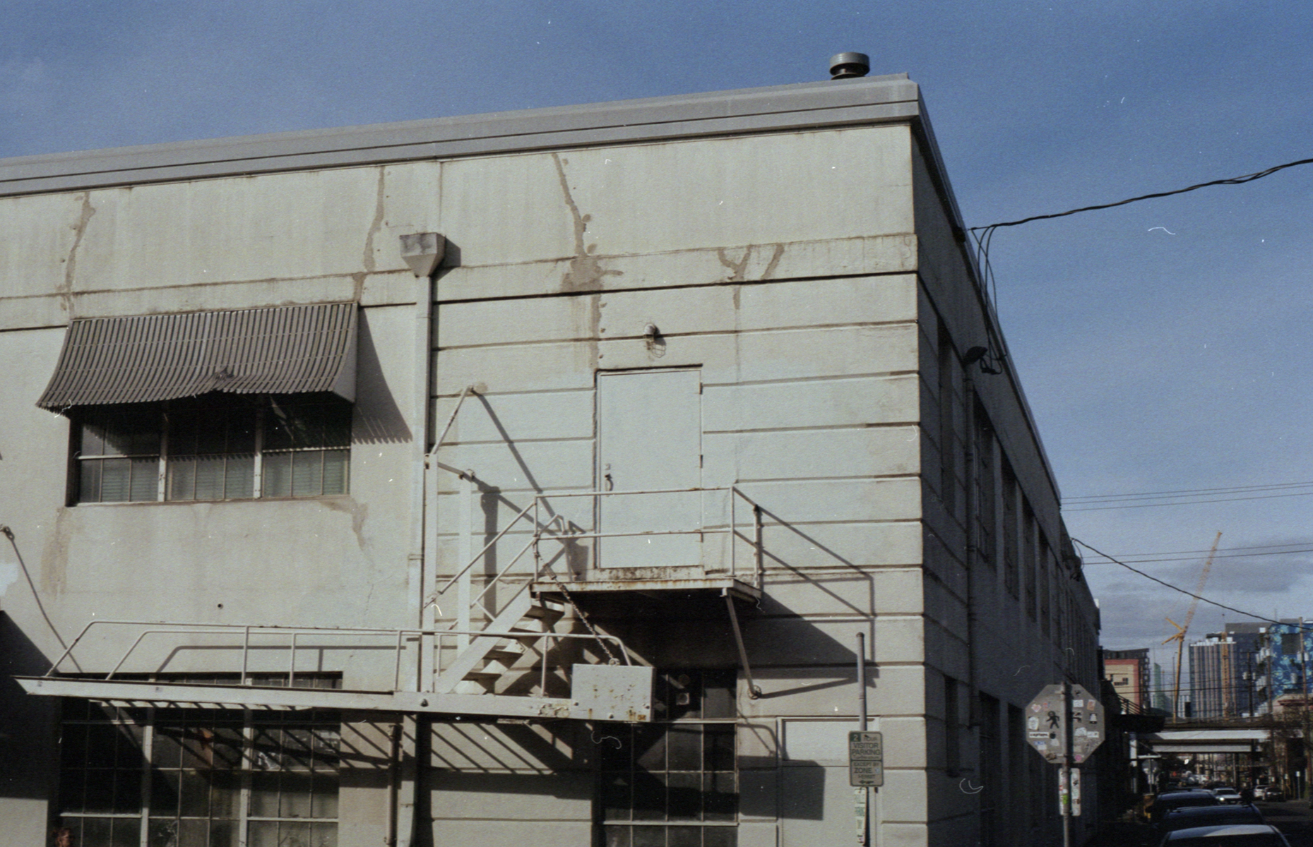
Photos of Chimneys, March 2020
Photos of chimneys in NE Portland. Shot on Kodak Gold 200.
Photos, February & March 2020
Here’re some photos from a roll of Kodak Gold 200 that I shot on a Pentax ME camera. I shot the first 2/3 of the roll in February and the rest in mid March.
Process Post - Materials I use
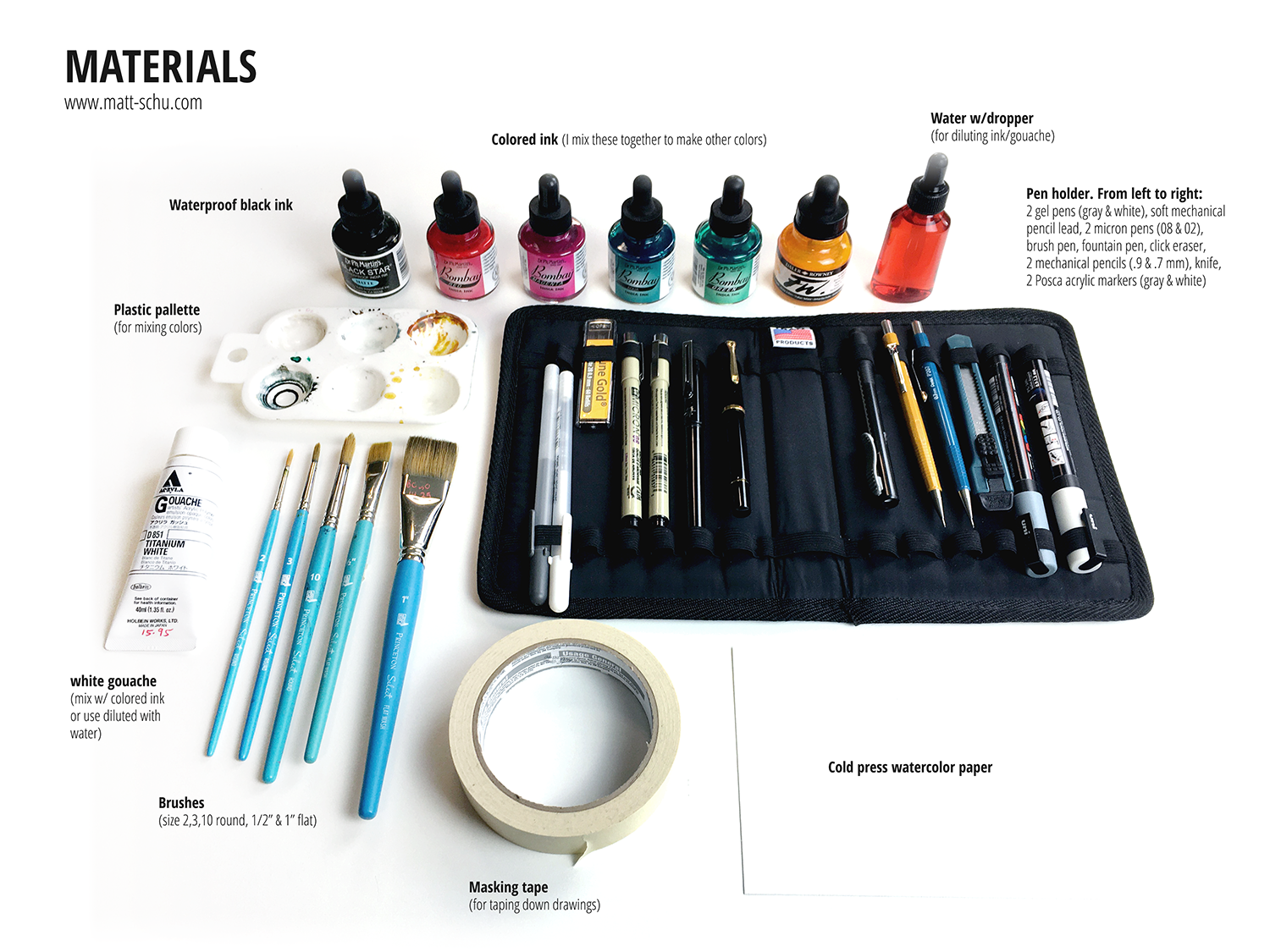
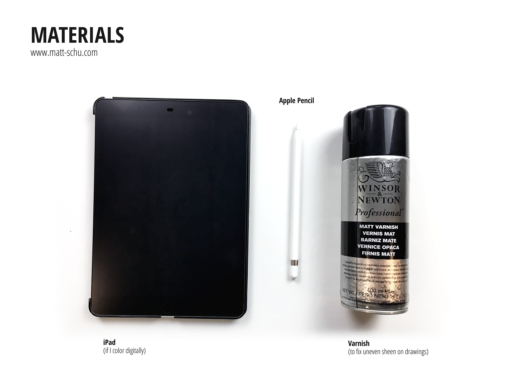
I’m always curious about the materials other artists use, so I put together this post of my materials (scroll down to see pics). Generally speaking I use pens & ink & gouache on watercolor paper. I mix the ink in a palette and dilute with water to change the opacity/intensity of the colors. I try to keep my setup as portable as I can, so — other than the bottles of colored ink and the varnish — I carry all of this with me in my backpack wherever I go.
Not pictured is the Epson scanner I use. When I’m done with a drawing I’ll scan it as a 600dpi PNG and then open it in Photoshop to adjust the colors and contrast to match the real life version as much as I can. Alternately, if I planned to add color digitally, I’ll scan the grayscale ink drawing and add color in Photoshop. When I do this, I’m not concerned with making the scanned grayscale version match the real life version as much as I’m concerned with making the contrast strong. When coloring digitally, I’ll use my iPad as a drawing tablet connected to my computer. To do this I use the app Astropad.
Here’s are some random tips:
Windex (or generic window cleaner) works just as well as pen cleaner, if not better, for a fraction of the cost.
Buy masking tape at a paint store, not the art store. The paint store will have more options for way cheaper.
When applying the varnish, build up thin coats. If you put on too much, it can pool weirdly and leave a white powdery residue (and it’s a waste).
I apply linework and spots of black first, then add color/shading with ink. That’s why the black ink being waterproof is very important to my process.
Process Post - Caught in the Rain
Here’s a summary of my process for a recent drawing, which I’m calling “Caught in the Rain”. This is one of several drawings featuring this old man and his black cat.
I wanted to draw these characters again, and I also wanted to draw some rain. After coming up with the idea, I started with a quick thumbnail sketch (fig. 1) to make sure I liked the layout (when I draw I use Xs to indicate which areas will be filled with black).
Next I made a grayscale ink drawing on watercolor paper (fig. 2). I drew the outlines with a micron pen, then added gray tones with a series of washes of diluted black ink. After that, I added black with a brush and ink, and drew the rain with gel pens and a ruler.
Once the grayscale drawing was done, I scanned it and opened it in Photoshop (fig. 3). In Photoshop, I adjusted the black/white/gray levels to make sure the contrast looked good and had pure black and white. Then I added color with layers set to different modes (fig. 3). Overlay & Soft/Hard Light modes tint the original ink drawing below, while Multiply adds a translucent spot of color.
After this, I adjusted the color balance and saturation to make the colors look how I wanted them to. Adjusting the color balance is also a great way to unify the color palette. I use adjustment layers when I can because they give me flexibility to change things later, as they don’t edit the original drawing in a permanent way.
Anyway, then I saved the finished drawing (fig. 4) and later posted it to social media. Now I’m blogging about the process and you’re reading it. And hopefully you found this interesting or helpful in some way.


